Arrundale Financial Planning
Branding & Identity
The Client
Arrundale Financial Planning is an Associated Partner Practice of St. James’s Place Wealth Management, one of the UK’s leading Wealth Management organisations, specialising in personalised financial advice with a commitment to building trusted, long-term relationships with clients.
The Brief
The client was looking for a rebrand that represented their core values – integrity, truth, and honour. In terms of look and feel, we wanted to create a luxury brand feel for Arrundale Financial Planning, to convey an air of professionalism and stability.

The Creative Process
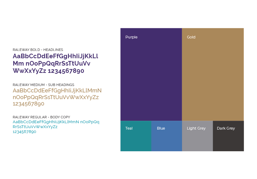
The brandmark icon is an abstract shape that represents a nestegg – the perfect icon to represent savings and investments, with a nurturing feel. The brand colours include rich purple, teal, and gold. Purple and gold represents wisdom and wealth, whilst teal combines the calming properties of blue and growth properties of green. The brand typeface is Raleway, which has been chosen for its elegant and contemporary feel.
Once the logo was finalised, the other brand assets were created along with a robust set of brand guidelines. This included business stationery, and social media banners and post templates.


 eosDesign Lighting
 »
»