The Banks Fitness
Branding & Identity
The Client
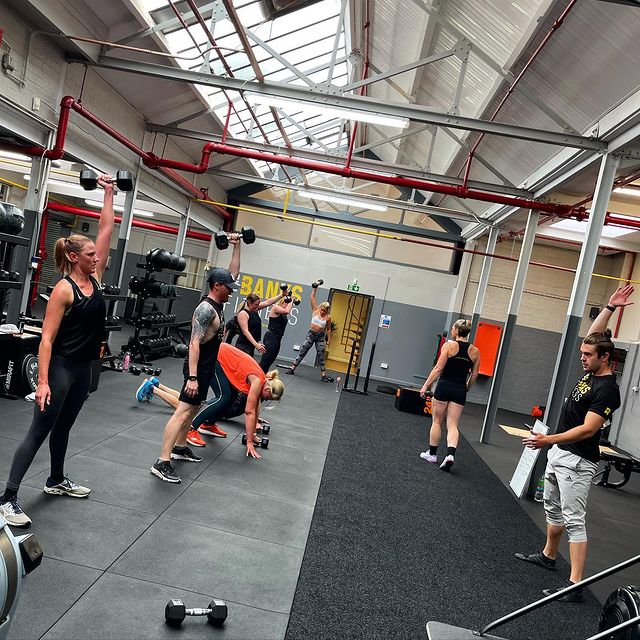
I was approached by the client and asked to create a brand identity for their new fitness gym. Their goal was to create a fitness community and bring people together and support each other, leading to healthier bodies but also a more positive mindset.
They wanted to challenge peoples beliefs – that fitness doesn’t have to be about just lifting weights or purely physical. It also has a massive effect on how you perceive yourself and life. A Healthy Body = A Healthy Mind.
The Brief
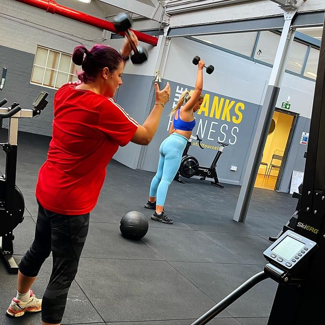
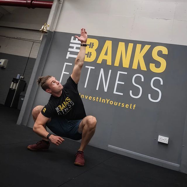
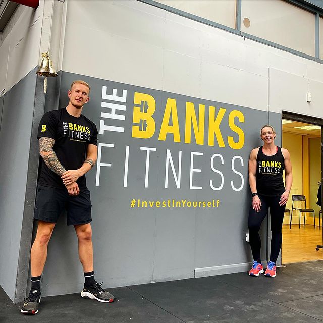
The client needed a brand identity to represent their cove values and appeal to both women and men. It needed to be bold and make an impact as they planned to feature it on interior and exterior walls.
The Creative Process
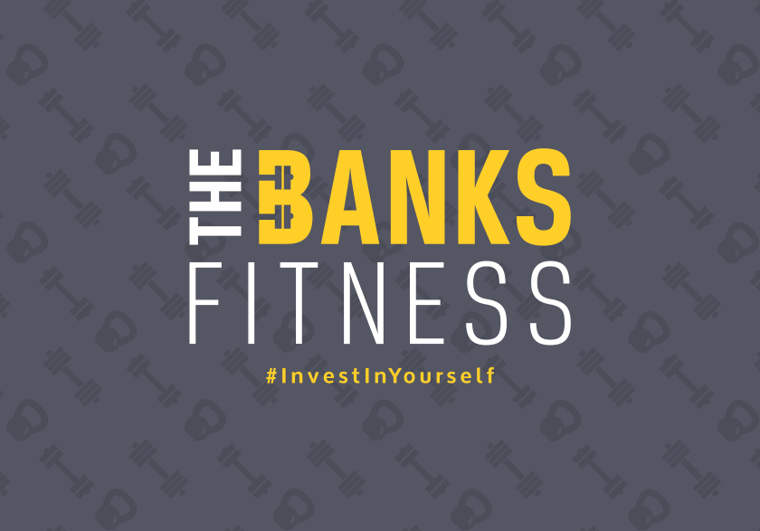
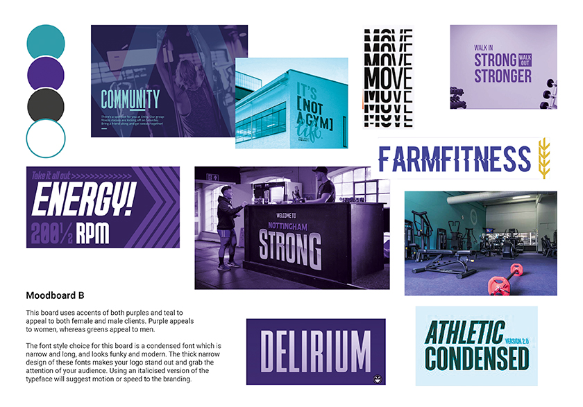
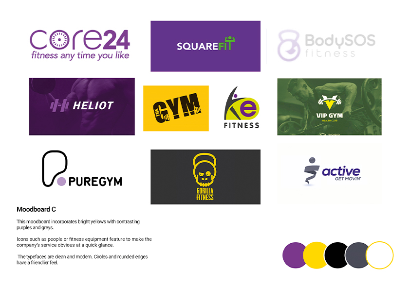
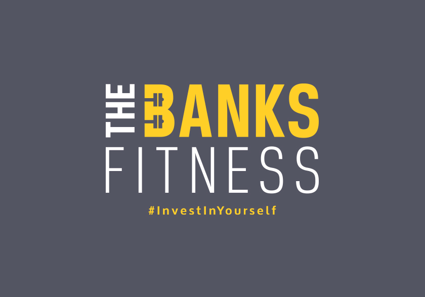
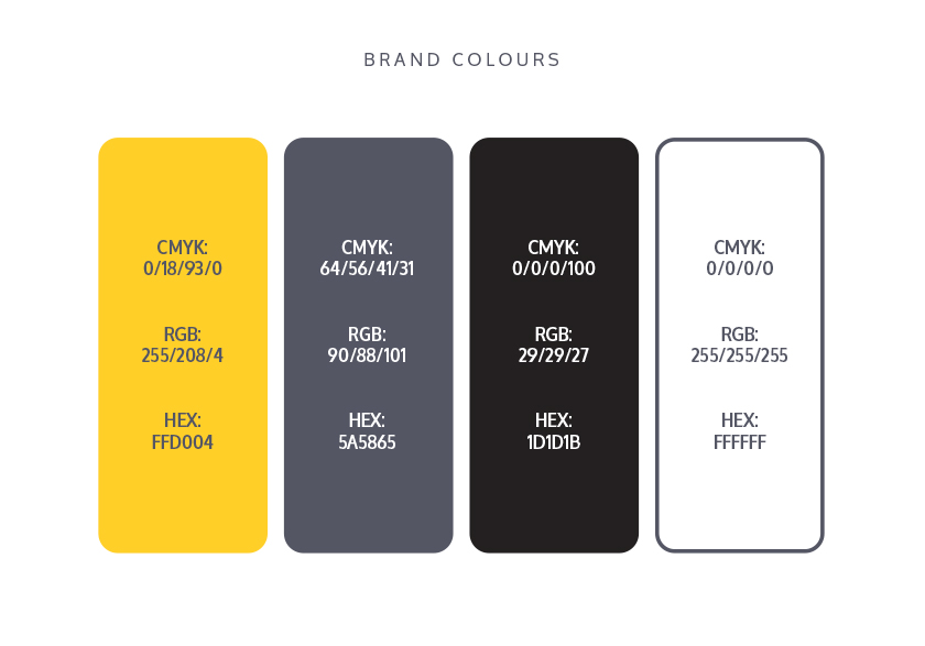
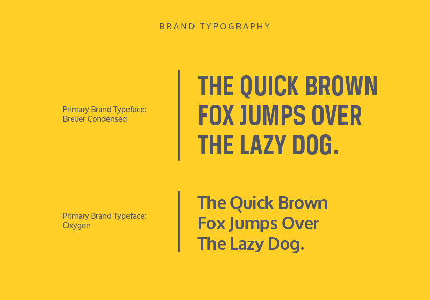
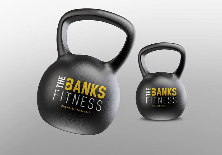
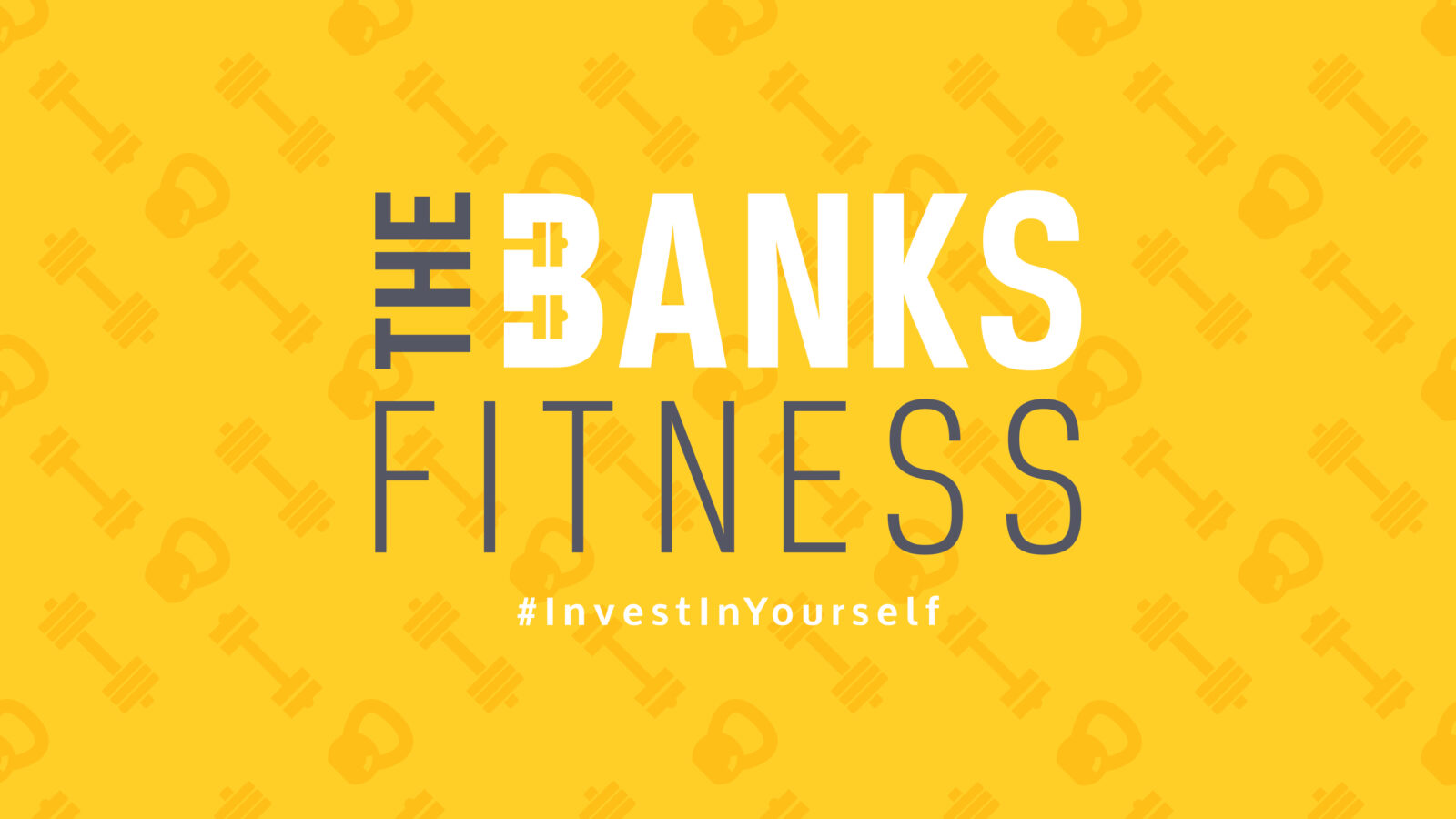
We began the branding journey with a discovery call and this led to the development of the mood boards. Once the client had identified which path they wanted to take with the brand, I set to work creating the initial logo design concepts. The brand colours are bold with yellow representing positivity and energy and grey representing neutrality and balance. The font is … – a narrow typeface that is strong and sturdy. The logo brand mark element incorporates a cutout pair of weights in the hollows of the letter B.
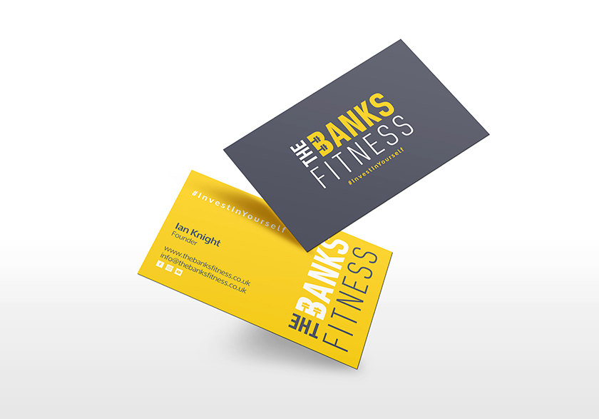
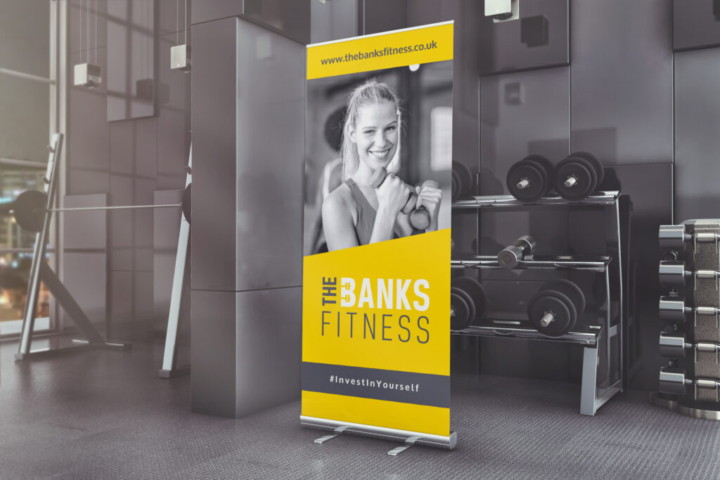
Once the logo was finalised, the other brand assets were created along with a robust set of brand guidelines. This included business cards, a pull-up banner, and social media banners.



 Arrundale Financial Planning
 »
»