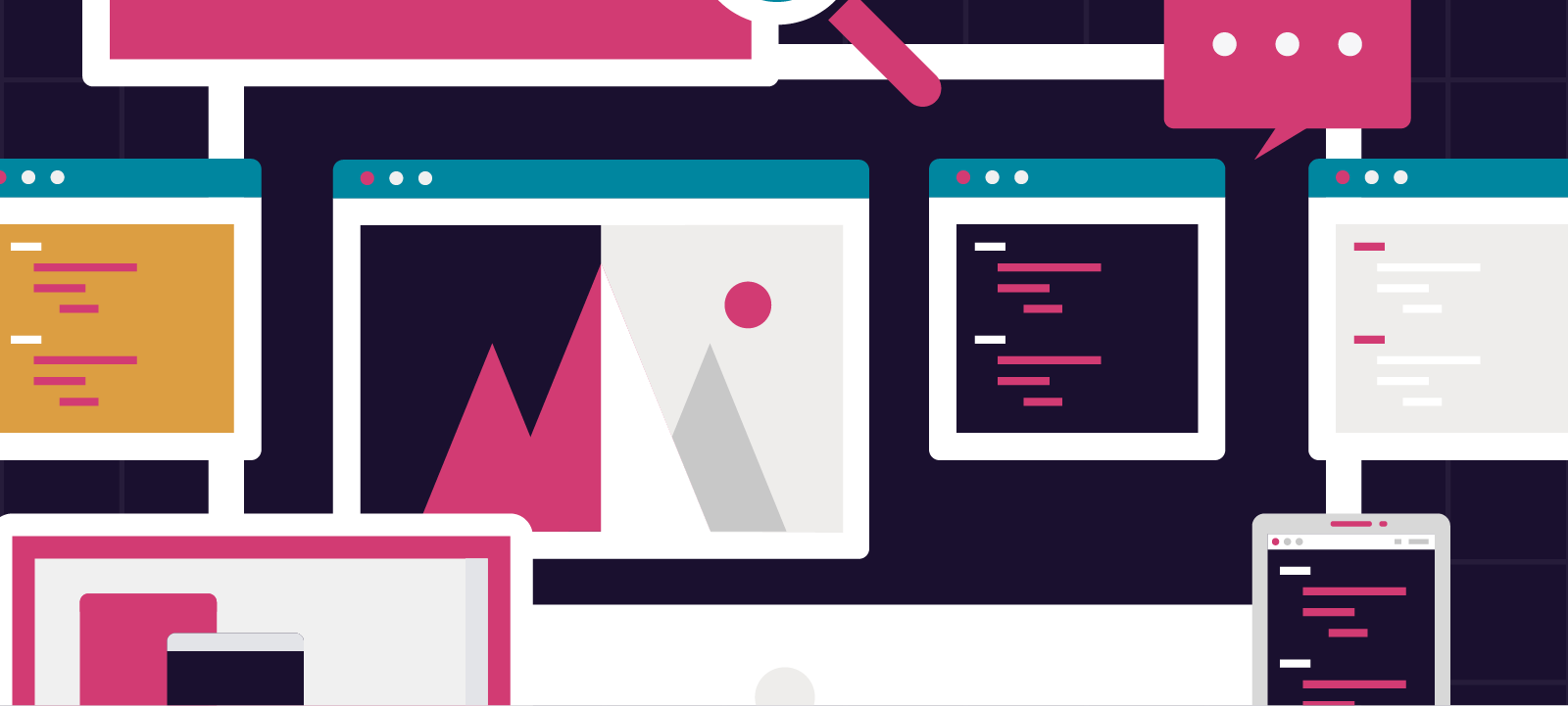
What Makes a Good Website?
First Impressions on a website mean a lot, they can affect bounce rates dramatically, so getting key information above the fold is integral to entice the user to continue through the site. Information needs to be easy to find, relevant and look pleasant.
User Experience
User experience is a really important part of a website design. It relates to the user’s online experience and journey and uses existing beliefs, attitudes, and behaviours to create a more efficient and optimised user-friendly experience.
Interactions can help to increase the ease of use, by encouraging positive ‘flow’. A good interface allows users to navigate your site without getting confused or distracted, and it can also help users to feel like they are in control and are then more likely to have an enjoyable experience.
Design Elements
As well as good functionality, it is also important to create online interfaces which are presented in an aesthetically pleasing way, as first impressions are formed within the first seconds of entering a new website. Typography, font size, layouts, and colour schemes are all important factors in creating credibility, as they help to shape users responses through aesthetic cues and their associations.
The following elements can help create good user experiences:
- White space
- Page speed
- Call to actions
- Interactions (thinks to do or click)
- Use bullet points instead of long paragraphs (easier to scan read)
- Headings guide the user (explains what the section is about)
- Pages must be uniformed and consistent in fonts and styles
Responsive Design
Responsive website design is the process of designing a website that changes and adapts to different viewing screens, ie desktop, tablets, and mobile devices to make it the best viewing experience.
Portable devices are much smaller than the average desktop computer. It is important to reduce or hide the content on smaller screen sizes so that the websites do not become too lengthy. Users will access information differently on mobile to how they would on a desktop computer. For example, users can not see hover images on mobile, as there isn’t a mouse cursor to hover. Also mobile websites will need larger link buttons and menus as it is more difficult to click on small links. Images and text will need to be resized so that information is easy to access and read on smaller screens. These subtle differences need to be considered when creating a website so that it is accessible on all types of devices.
 Storytelling for Business
 »
»
Leave a Reply